Thursday, 21 May 2015

Questionnaire results

I carried out a questionnaire on ten people asking them about my FMP. These are some of the results i got:


  • From this questionnaire i found that 70% of thought that the front cover for my book looked professional.
  • I also found out that 90% of the people i asked said that they would be interested in reading the book if they only saw the front cover.
  • By asking people if they thought the background looked effective, 100% said yes. 
 

Wednesday, 20 May 2015

FMP questionnaire

What is your favourite aspect about the front cover?


How much would you pay for a book like this?
£3-£5.99
£6-£7.99
£8-£10


Does it look like a professional book you would see in a book shop?


If you had to change one thing about it would it be?


If you saw this in a shop would you be interested in reading it just from the cover?


Is the colourful background a good or bad thing?


Is the effect on the photo a good or bad thing?


Is you favourite aspect of the cover the character, the background or the text?

Peer assessment

Joe baldwin:
I think that it looks very professional. If i saw it in a book shop i would pick it up. This is because it grabs the customers eyes and draws them in. The main reason for this is the bright colours. Most book covers are quite plain and boring but this one stands out against the rest. One thing i would add to it is something to do with the story. For example a gun or car chase something to emphasise the fact that it is a thriller/action book. But on the whole think its looks really good and professional.

George Morris:
The front cover looks really good and colorful. The best part i think is the picture of the character that has been blurred out. This is good because it relates to the story which is about memory loss. It relates because when someone has memory loss everything can seem clouded and distorted. There is one thing about it that im not sure about which is the background. I think its a bit confusing and not clear what its ment to mean. Overall I think it looks really good and looks like a normal book you would find in the library.

FMP evaluation

My project is the front cover of a book called Amnesia. It is the theme identity. The books about a man who wakes up with amnesia and can't remember anything. He is trying to figure out his identity which is why its the them identity. I also made a poster for the book release.

           Book cover                                                                                                       Poster


Strengths:

  • The title is easy to read and stands out well on the background.
  • Colourful, its not dull its grabs the readers eyes. 
  • Good use of font. Relates to the subject of the book.
  • Picture of main character.
  • Intriguing, If a reader saw the cover they would want to read the book.
Weaknesses:
  • Doesn't have bar code or publishers name.
  • Background may confuse reader slightly.
  • Looks a bit more like a poster than a book cover
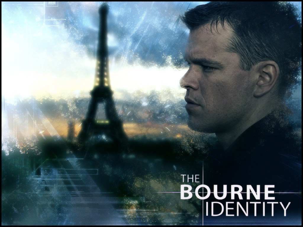
When i was choosing a theme i didn't have a clue which one i was going to pick. Also i didn't really have any ideas at all. Util i was doing a mind map of ideas for the theme identity. I remembered a film i had watched called bourne identity. I thought instead of doing a short film i would make a book cover because it is something different. I roughly based my idea for the book on the film bourne identity but changed lots of the key parts. 

I experimented lots with different effects on photoshop. I wanted to add some effect to the pictures on my front cover. But i wanted the effect to relate to memory loss somehow. Memory loss is the main focus of my story.

With the picture of the character i wanted the effect to capture and symbolise memory loss or not being yourself because you can't remember anything not even about yourself. The first picture has an pixel dispersion effect. This represent the character losing touch with himself because he can't remember anything. The second image is blurred out. This symbolises that he can't figure out what anything is, not even who he is.   It also draws the reader in without revealing much of the story.  


Just like the picture of the character i wanted to capture memory loss in the background. I did this by applying different effects on photoshop. My favorite one is the first one. I didnt mean for this effect to happen but the end result was surprisingly good and i captures memory loss the best out of all of the. This is because the picture is cut up and randomly rearranged. This is idea for memory loss as someone suffering from memory loss can't really piece the memory together. also some parts are blurred and overlapping which adds to the sense of confusion.  


I think there are some similarities and some differences between my book cover and a professional action/thriller book cover. Similarly the text stands out really well on the background. It is easy to read and eye catching. Also both have a picture of the main character. But both don't just have a picture of him stood there. Mine is blurred out and the professional one is facing the opposite way. this Intrigues the reader as they want to find out more about the masteries characters. One difference is mine is a lot brighter and colourful. This isn't a good or bad thing as the professional  cover might be dark as it has something to do with the story. Where as mine being bright and colourful will attract the reader and make them want to read the book. 

When i first showed my finished project to my family and friends i was nervous about what they would say. But as soon as they saw it they liked it. They said it grabbed their eyes and made them want to read the book, Which is the whole idea of the front cover. They also really liked the poster. They said the play on words was very effective and witty. 

I think if i was going to improve anything about the final front cover it would be to make it look a bit more like a front cover than a poster. Evan though i was told it was a very good front cover in my peer assessment.  I could do this by adding barcode, publisher name ect. 

Since doing my statement of intent i have changed my idea quite a lot. I started off by saying i would make a whole book with illustrations as well. But after realising that i wouldn't finish within the deadline i decided to just focus on the front cover and a poster for the book. I think i have completed everything i wanted to and am very happy with my final product. 


Synopsis

The story of a man called Tom. Was found half dead in the middle of the rainforest laying on a logging road. When he recuperates, he realises he has amnesia without an identity or even knowing his name. When ambushed by a group mercenaries he soon realises that he has retained part of his past. and is able to defend himself with assassin like skills in fighting, guns, and self defence. He sets out on a mission in search to discover who he really is, why there is an group of assassins trying to kill him and who the temptress is which keep cropping up at the worst times.  

Tuesday, 19 May 2015

Daily Blog post

Week commencing 9th of March:
I was given the brief and the suggested themes. The themes were identity, environment and fairytale. I made three different mind maps. Each about a theme. I just put down anything that i could link to the specific theme. This helped me generate ideas.

Week commencing 16th of March
I am still thinking of ideas to do for my FMP. I used my mind maps to help me. I draw lines from each point to a different point. This helped my get more ideas and helped my think of things i would not have thought of with out the mind maps. 

Week commencing 23rd of March
Today i thought of four potential ideas that i got from my mind maps. I produced a blog post about them looking at the good and bad points.   

Week commencing 13th of April
Today i developed my chosen idea. I also made a schedule. This is very useful for me when i start to produce my FMP. It will help me massively to keep to the deadline.

Week commencing 20th of April
I started planning my front cover today. I did some sketches of different ideas i could use. I also started to think of what effects i could use on the pictures i use. I will use photoshop to add the effects.

Week commencing 27th of April
I started testing out different effects on images using photoshop. I tried out four effects for the character and four different effect of the background.


Week commencing 4th of May 
I researched book front covers that were action/ thriller books. I did this so that i could see what products were out there. Also so i could find out what is common for action books front covers. This helped give me ideas for my front cover, like what images to put on there.   

Week commencing 11th of May
I looked at fonts that i could use for my front cover. The font is one of the key parts of a good front  cover. the text needs to be easy to read and stand out. That is why i had to spend time choosing a font.  Also i had to shoot my picture for the cover. I took five picture of George. This was to choose which photo looked the best. Each photo had the lighting set up differently, this made eau picture look different.

Week commencing 18th of May
I started to add the effects to the picture i chose. This is the picture of the main character on my font cover. I chose to add a blur effect to the picture of the character. This suits the subject of memory loss which is what my book is based on.


Week commencing 20th of May
I have finished my book cover and i am very happy with it. I think that it looks like a professional book cover and could see it being in any bookshop. I have also started making my poster which is about my book.
Front cover
Poster

FMP Poster

This is the poster that i made for my FMP. It is the poster for the book amneasia which i designed the front cover for. Before i designed it i researched and looked at some existing posters for similar films/books. I found some similarities when i looked at action/thriller posters, The title is always the biggest text and stands out massively compared to all the other writing. This is why i made the colour of the title white with the background black.  Also most of them would have a picture of one of the main characters. I have half the face of the main character. This is also quite popular for action/thriller posters. After i started making it on Photoshop i thought it looked plain with just the title and a picture of the main character. So i added a sniper crosshairs. This is probably one of the most common things i found on similar posters. Also i had to test out different fonts to use for the slogan. I decided on this because it looks like the sort of font you would see in the army.


Wednesday, 13 May 2015

Fonts

The text is one of the most important thing about a front cover. Especially font, he font used can change the whole cover of a book. It can make it go from a thriller action story to a children's book. This is why i had to think very carefully about what font i was going to use. I wanted something that capture the theme of memory loss and more importantly captured the genre, action thriller.    


Tuesday, 5 May 2015

Front cover effects

For my front cover i am going to have a picture of my main character and in the background a picture of the london eye. The reason i am hang the London eye on the cover is that almost anyone and any age would recognise it and know what it is. But because my story is about a spy that has memory loss, I'm going to blur the image so it is hard to recognise what it is. This is so that the front cover reflects what the book is about. I am going to do the same with the picture of the character.


Character Picture effects:
character3Screen Shot 2015-04-29 at 13.03.29.png
Screen Shot 2015-04-29 at 13.02.30.pngScreen Shot 2015-04-29 at 13.02.41.png


With the picture of the character i wanted the effect to capture and symbolise memory loss or not being yourself because you can't remember anything not even about yourself. The first picture has an pixel dispersion effect. This represent the character losing touch with himself because he can't remember anything. The second image is blurred out. This symbolises that he can't figure out what anything is, not even who he is.   It also draws the reader in without revealing much of the story.  


Background effects:
Screen Shot 2015-04-29 at 13.03.37.pngScreen Shot 2015-04-28 at 14.38.29.png
Screen Shot 2015-04-29 at 13.02.52.pngScreen Shot 2015-04-29 at 13.03.09.png


Just like the picture of the character i wanted to capture memory loss in the background. I did this by applying different effects on photoshop. My favorite one is the first one. I didnt mean for this effect to happen but the end result was surprisingly good and i captures memory loss the best out of all of the. This is because the picture is cut up and randomly rearranged. This is ideal for memory loss as someone suffering from memory loss can't really piece the memory together. also some parts are blurred and overlapping which adds to the sense of confusion.  

Today i tried out different kinds of effects i could use on the picture I'm using on the front cover.


Shooting Photo

On my front cover i am going to have a picture of the main character. The Picture will only be of his face. Lighting is very important when i take the  photo. This is because the lighting can change the entire mood of the picture.
 Above is the plan i made for trying out different types of light for the shot on my front cover. Getting the lighting right on a photo is very important. I think my favourite one is number 1. This is because it will make half of the photo relatively dark

Thursday, 23 April 2015

Evaluation of research

Out line of the research:
 From doing the research i font out that the majority of the writing on the front cover was in white. This is so that the text stands out and is easy to read. I will use white text on my cover for the same reason. Also all of the text was centre aline, this looks good from a design point of view. All the covers where colorful this is so they stand out and are intriguing to the reader. This is very important as the cover is the first thing the reader will see. You dont want to give to much away on the front cover about the story. I think i will just have a picture of the main character. This also give the reader a picture of what the main character looks like.

Reflecting on research:
I wanted to see what similar products where out there. This helped my develop my ideas and give my a good indication of the competition. I mostly looked at secondary research, This involved looking at book covers and short stories online. I have also looked at actual short story books and short stories in newspapers. For my front cover my colour scheme is going to be dark colours. This is because it makes the book look intriguing and mysterious. I need to shoot a photograph of the main character. When i shoot this i will use lighting to give the character a glowing look. This will make him look like his is standing out in the dark background. I feel a lot more confident to carry on with my idea after research. This is because looking at similar products helped my to develop my idea into what it is now. One of the most of important things i found out by doing research is that the text should be white and in a easy to read font. Also it is good to have the protagonist on the cover. Another important thing i found out is the cover must be interesting, if its not it is unlikely many people would read it. My idea has not changed very much since doing research. But after doing the research i have decided to add a picture of the main character to the front cover. Before this is was just going to have images of famous monument blurred and disfigured. Now i am still keeping the origianl idea but adding a still picture of the protagonist.  

Developed Ideas

Out of the 5 covers/posters i have looked at almost all of the writing is centre alined. I will be using
this on my front cover. Also my writing will be in white so that it stands out on the background. Because the main theme of the book I'm doing is memory loss i want to have a main character on the front with different thing he should be able to recognize but they will be blurred and distorted. This shows that he can't remember what anything is.
Something similar to this:

Wednesday, 22 April 2015

Front cover research

This is the poster for the film Bourne Identity. I think it is really good because the background is all blurry and not in focus. This symbolises the mans memory loss and how he can't recognise. I would like to make a similar front cover for my book. I would use photoshop to make the cover. I can make images distorted and blurry on photoshop. The title is in a bold white font. This is so that it stands out on the dark background. It has a picture of the main character so that anyone who sees this knows that he is the main character. 


This is the front cover of the book Patient Zero. The main picture on it is the finger tips of someone pushing through the cover. I think this is a very good front cover as it is different. Also it shows the reader that the book will be an action/horror genre. You can tell this from the blood and the fact someone is clawing his way through the cover. It doesn't give too much away about the plot or anything but makes the reader intrigued. 


This is the front cover for the book Black Mountain. On the front cover there is a very dark and gloomy road in the woods. Also you can see a shadowy black mountain. I think it is good that this is the main focus on the front cover because it is the name of the novel. The font on the cover is in white so it stands out on the dark background. It also has a glowing effect on it similar to the moon glowing next to the mountain. There aren't any of the characters on the front which leaves it to the reader to find out. It sets the scene of where the novel is based. 


Australia Day is a thriller/action novel. You can tell this just from the front cover just because of the colours used and the symbol taking up most of the cover. The symbol represents nuclear, radiation and death. Also there is a famous Australian bridge. This sets the scene and shows the reader it is set on Australia. The font is very bold and takes up almost half of the cover.      


This is a poster for the film gangster squad. You can tell this from the images on the poster. Most people are holding guns and all look extremely serous. The pictures of the main characters have a HDR effect on them. This gives them an unrealistic look this effect is very similar to the effects used in things like magazines. The font looks like an old press font used in America. This is very relevant to the time the film was set in.


Today i research front covers/posters for books of the same genre i was doing. This helped my get ideas and gave me a good idea of what the competition is like. By looking at products it helped my improve my idea.


Tuesday, 21 April 2015

Research

For my research i looked at short action/thriller stories online. These are some of the stories i looked at:  
                                                                                 
I found that all the short stories were similar as there is always something interesting happening. This is because if they are boring the person reading it would stop. This is every important because it is a short story and the reader needs to be interested the entire time.


I learnt about the 180 degree line that you are not allowed to cross when recording a film.

What if i change the plot slightly.


Today i research short stories. I found that all the short stories were similar as there is always something interesting happening. This because it is short it has to keep the reader interested all the time. But since doing this research i decided to not write a story instead just focus on the front cover and write a short synopsis.

Pre production mindmap

This mind map helped me think of what i could add to my idea. By people asking questions on the mind map. After this i changed some aspects of my idea.

This mind map is on pre production. It show what i am going to have to do to prepare before making the short story. 


Today i planned out what i would have to do in my fmp. I also put down targets on the mind map. After this people in the class would ask questions based on what my ideas. This helped my develop my idea into a  more realistic idea. 

Wednesday, 18 March 2015

Ideas

After doing a detailed mind map i mad links between different points. I focused on one of those links which was identity theft and not knowing your identity. I have seen a film called the born identity. The film is about an American spy that doesn't know his identity. When someone loses their identity that person can feel extremely lost as the don't even know who they are, what they like o`r what they do. The film explores these subjects very well. i could then make a short graphic book similar to the story of bourne identity.


I thought about doing a documentary about where i live, Frome. Frome is known for being an up and coming town. As it is known for its music, art and food markets.
I could show all the different sides of frome. For example Music, art, food markets, what the youth do


I think there would be a lot of things to say about frome as it a very lively town with a lot of different things happening. I could get interviews with people that live in frome and ask them questions about frome.


i had some ideas about making a film about a city. persuade people to go out and have fun in the city as in my opinion there is a lot more to do and have fun in a city rather then in the country side. I could make a short film focusing on one city for example Bristol or London. It would highlight all of the different things you can do there. I got this idea from doing a mind map.


Another idea i had was to make short film about skate parks. I thought i could interview bmx riders, scooter and skateboarders. I would get there view on skate parks and how most of them are run down and very poorly equipped.

Today I had to think of ideas for my fmp. I thought of four but the first one is my favourite. This is because it is different to what everyone else's idea also i can use photoshop which is my best area of the course.